Men’s Shirts in Detail
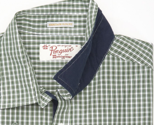
Now that Negroni is out there, I wanted to share some inspiration we’ve collected for little details you can add to spice up a guy’s shirt. First, I’ll start with some cool details from retro menswear company Original Penguin. I love the dark contrasting underside of the collar on the double nugget shirt above, and it would be a very easy change.
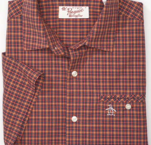
I think the welt pocket on this cotton check shirt looks great in the small plaid.
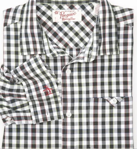
The tiny pocket detail on this check tonic version is really cool, and I just about always love black and white gingham on men.
The double buttons on Mister Meanor remind me a little bit of a chef’s jacket.
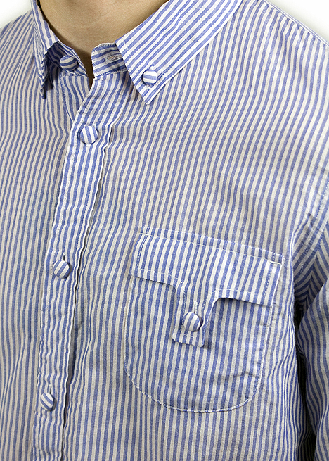
Covered buttons on a men’s shirt? Plus bold ticking stripes? Plus sort of weird geometric pocket flap? Why not, it works on this one from Robert Geller.
Or how about squared-off pocket flaps and button tabs for rolling up the sleeves? Dark chambray is also my absolute favorite right now, this one is from Obey.
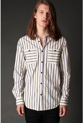
And here’s a cool wide spaced stripe Rachel found, with some fun directional variation on the pockets, from UO.
Hopefully that’s gotten your gears turning and given you a few ideas for variations on your Negroni. All these little details might help explain why menswear sewing gets addictive.

 Sign In



Comments
G
December 6, 2010 #
Great! And you can also make diagonal buttonholes: http://www.burdastyle.com/projects/diagonal-buttonholes
Mary Beth
December 6, 2010 #
The big trend with men’s shirts these days is the large-scale print motifs – dragons, letters of the alphabet – on top of print. That I’d like try sometime. Just don’t “girlfy” the shirt with metallics or pink fabric. Got keep it manly.
Pam ~Off The Cuff~
December 6, 2010 #
I bought your new shirt pattern and am looking forward to making it up :)
I am a ShirtMaker by profession and usually custom design and hand-draft the patterns for all of my clients…but…my blog followers are always asking me for shirt pattern recommendations..so that’s why I am so anxious to try and test yours!
I do not sell anything on the site that is linked to my name on this comment, but FYI, there are lots of shirt design ideas and shirt construction tutorials posted there :)
Tasia
December 7, 2010 #
Great ideas! I like the contrast undercollar, it’s a simple but nice touch.
Sidd
May 12, 2011 #
very good…
Ross Hoodies
September 25, 2012 #
For the first three pictures of the chequered shirt, I honestly prefer the underside of the collar to be the top part of the collar. That’s because it’ll be one of a kind design instead of all plain boxes on the shirt. The patterns of boxes are just too common already. I know it’s a trend for retro but some retro fashion just don’t fit in with the current times anymore. The fourth picture with the two buttons, well, the shirt is nice but yes, that design of two buttons really spoilt, does look like a chef’s clothing. The fifth shirt and seventh shirt, is just plain horrible for me. It looks like the design was ripped off from a handkerchief and the manufacturer just expanded the handkerchief to make it a shirt size. The second last picture, the sixth shirt, was awesome in my opinion as I love guys who wear those kind of design. It’s smart, doesn’t look too over the top and rolls off as smart but casual.